DISPLAY AT THE DOUBLE
Over the summer a number of the bus shelters were replaced in the area where I live. All installed with double sided, dynamic digital displays owned and programmed by JCDecaux.
I have to declare as a consumer I’m a fan and as a marketer I’m even more fascinated by the opportunity they represent for brands to reach the right audience, at the right time, in the right place with the right message.
It brings a sophistication to Out Of Home that allows the advertising brand to deliver a narrative which is perfectly tailored to the situation not to mention the potential (when issues of privacy are overcome) to serve up personalised ads to an individual when they are close by.
That’s the positive aspects out of the way.
Two things have bothered me during recent campaigns.
The first was a geographically tailored ad for a retail outlet where they had used the local authority name to describe the area. In this case ‘Hounslow’ when the display was in fiercely independent ‘Chiswick’. If that had been a standard billboard the error would have been met with a shrug of the shoulders but with all the nuance of digital placement it felt like a glaring error.
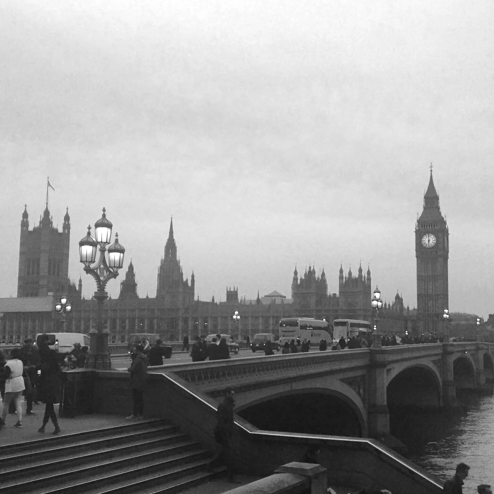
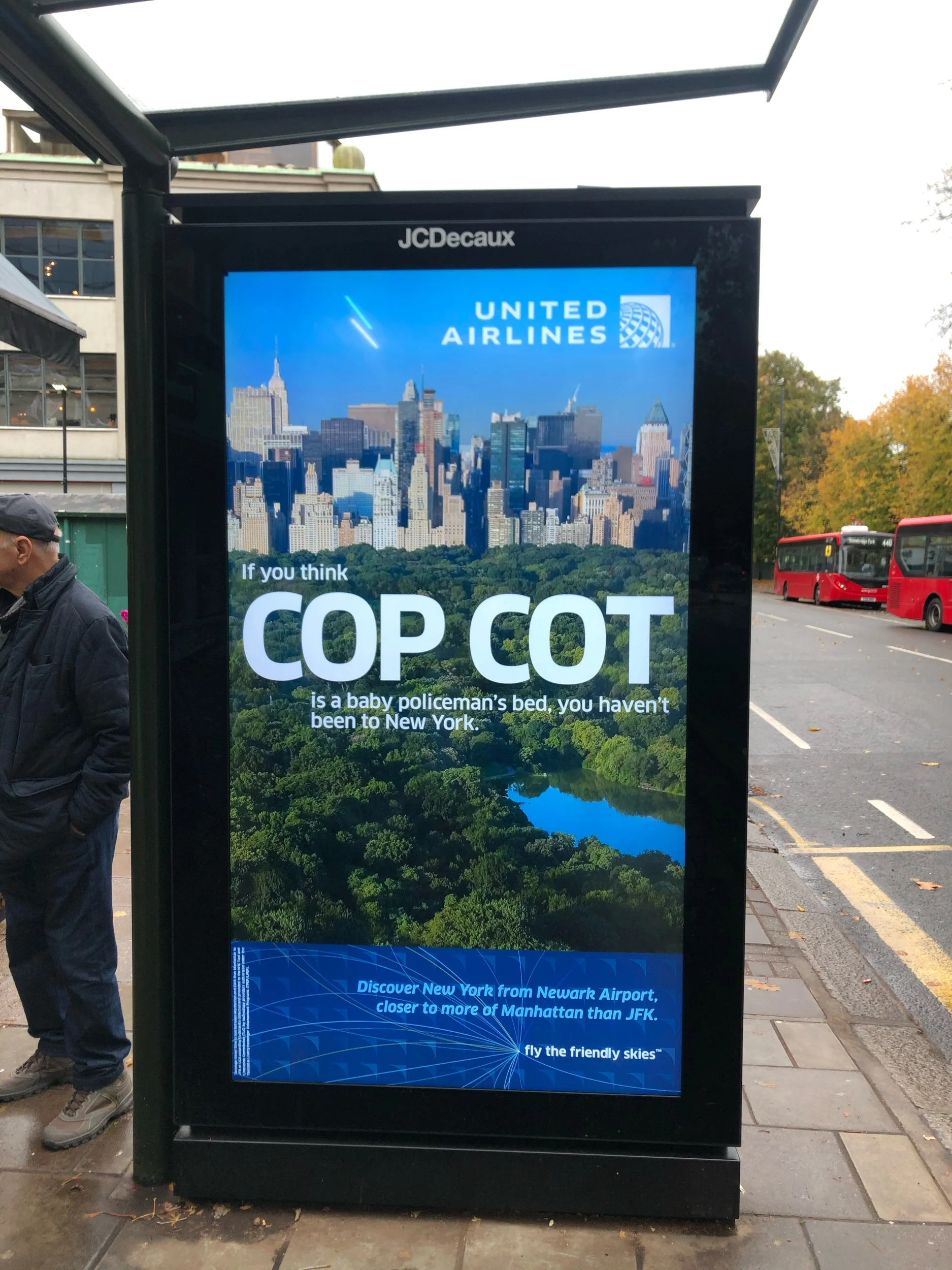
The second was much more confusing and I managed to take pictures. United Airlines and British Airways were both advertising on the same display, BA following UA. If United Airlines displayed an ad about flying to New York City then British Airways followed with a ad for New York City.
One cycle later the same pattern emerged but this time with a Utah / Arizona ad.
I almost missed my bus to see if this kept on happening - it did.
The result of this was I left with the message ‘must visit America’ and the United Airlines and British Airways messages were lost.
I can’t imagine a media planner signing off on that or the brand owner so perhaps it was an error.
However, if I am missing some advertising theory let me know - I would be fascinated to learn something new !


